Optical Effects: Chromatic
Aberration
By Neil Blevins
Created On: July 13th 2020
Updated On: Dec 5th 2024
Software: Photoshop or Looks
Here's a tutorial discussing what is "Chromatic Aberration",
different methods of adding it to your pieces of concept art, and a
plea for going subtle.
You have two choices with this lesson, watch me discuss the issue in
the video below, or read the full text.
Chromatic Aberration is a lens effect that causes a slight rainbow
colored halo in actual photography. Here's an example, take a look at
this photo of a toy robot:
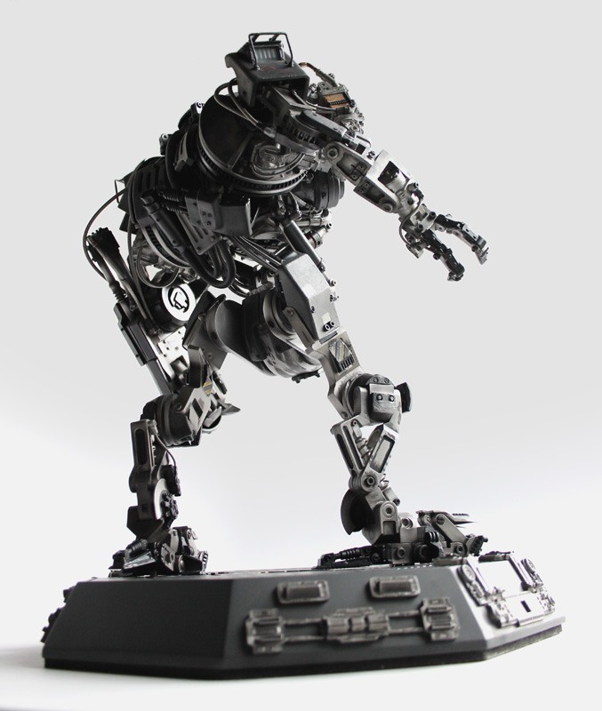
But now let's zoom in on the leg:
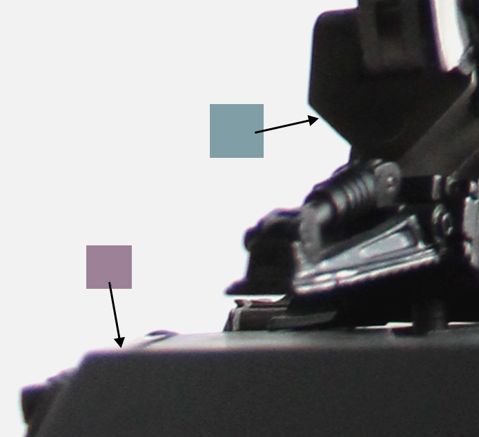
Notice how at the edges you're seeing Red/Purple bleed and Blue bleed.
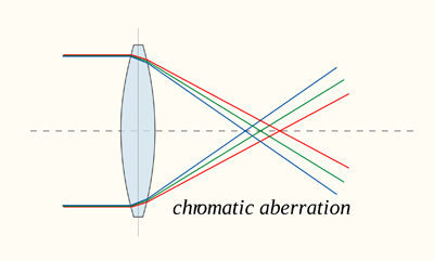
Why Does This Happen?
This happens in a camera lens when all colors of light do not
focus to a single point.
You may have seen an image like this is physics class...
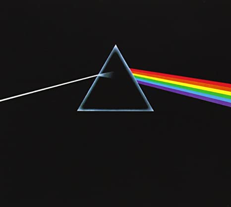
Or if you're a fan of Pink Floyd. White light, when it goes through a
prism, splits into individual colors, or wavelengths, of light. A good
camera lens is made to avoid this from happening, it's meant to take
white light in, and produce white light on your photograph. But cheaper
lenses will fail at this task:
By DrBob at the English language Wikipedia, CC BY-SA 3.0
And you end up getting some split in the colors. The cheaper the lens,
the more the variation.
But if you're making a painting that's meant to look photographic, some
subtle use of Chromatic Aberration can help make your image feel more
believable.
Method 1
One simple method to achieve a look similar to real photographic
Chromatic Aberration is to shift the color channels of your final
image. An RGB image has 3 channels, Red, Green and Blue. Each Channel
is itself a black and white image, defining how much the colors Red,
Green or Blue contributes to a single pixel in your image. So if these
3 images are slightly misaligned, that can reproduce this effect.
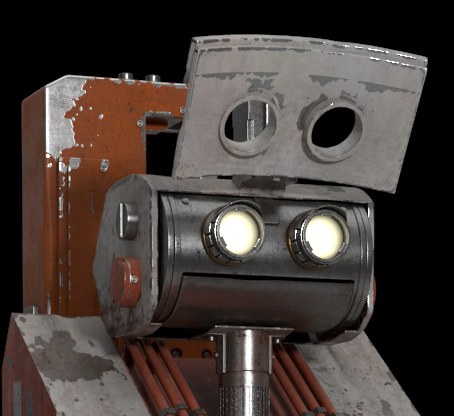
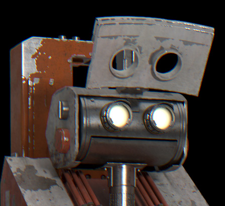
For example, let's take this robot head from my book "The Story Of Inc"
In photoshop (but this can be achieved in pretty much any paint
program), go to the channels palette
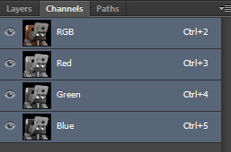
Let's zoom in so we can see better.
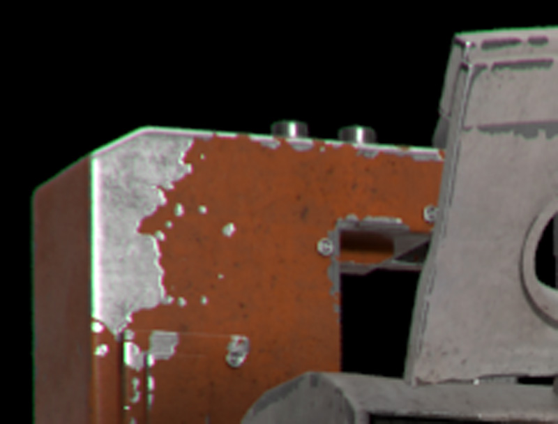
Select the Red Channel, then select your entire image, then click on
the Move tool, and use the arrow keys on your keyboard to shift it
slightly to the lower right. Then select the blue channel, and do the
same, but to the upper left. Here's the results.
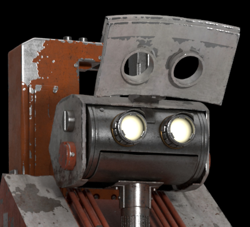
Now let's zoom out. It's subtle, but it's there, and adds to the
"photographic" look to the image.
Method 2
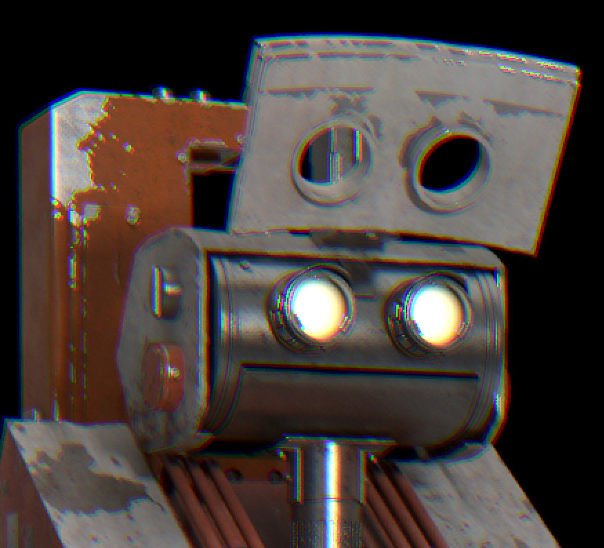
Method 2 uses a filter inside photoshop. Go to Filters -> Lens
Correction. Click Custom. Then adjust the 3 sliders next to Chromatic
Aberration.
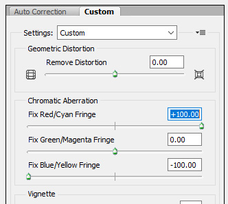
This creates a more subtle result.
Method 3
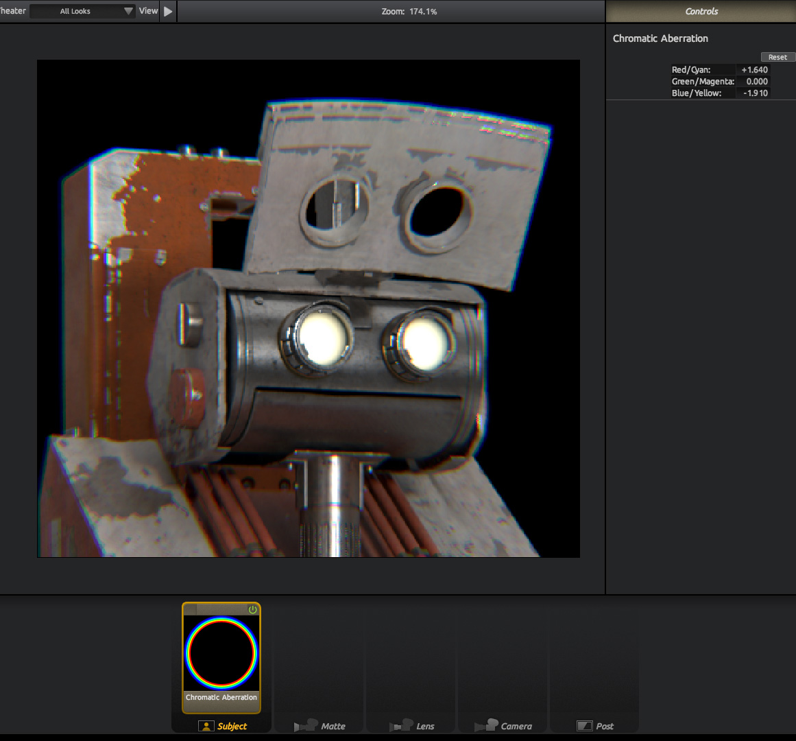
The method I use is using a piece of software called Red Giant Photolooks.
Sadly this software is now discontinued (but give these guys a shout,
maybe if enough of us pester them they'll bring it back to life), but
PhotoLooks is a great piece of simple compositing software that lets
you do various vignettes, blurs, glows, etc to your final image. Here's
the software used on this example.
The advantage of Photolooks is that it's procedural, so in Photoshop,
if you adjust the channels or use the Lens Correct FIlter, if you
change your image, you then have to redo your Chromatic Aberration
again. In Photolooks, it just reloads your changed image from disk, and
redoes the Chromatic Aberration with your previous settings, no need to
remember them, write them down, etc.
Note: Red Giant does still sell a piece of software called "Looks",
that works for Adobe After Effects, but it's more geared for sequences,
not still images, and requires a copy of After Effects, whereas
Photolooks is a standalone app. But if you really want to use it, go
for it!
Overuse
The key with using this technique is subtlety. Like lens flares
before it, this technique has been overused, which causes some people
to hate it all together. But if used with finesse, it can add some nice
extra realism to your image. As an example of going too far, a number
of years ago there was an awesome artist / comedian called Mr Concept
Art, who poked soft fun at the concept artists and hobbiest who were
overusing certain effects, including Chromatic Aberration. Here's an
example of their art:
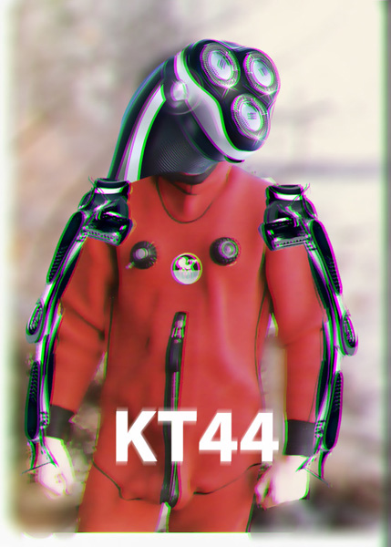
This is not subtle, this is TOO MUCH Chromatic Aberration for a serious
image. So unless your goal is to produce a funny image, use it
carefully. A little goes a long way.
This site is ©2026 by Neil Blevins, All rights
are reserved.
To see hundreds of other tutorials similar to this one, visit the
Neil Blevins Education Site