A color scheme is a color or set of colors that will appear again
and again in a painting, film sequence, group of characters, or
videogame 3d
world. It can be used to create
coherency, as a way to identify things that relate to each other, it
can be a part of a visual hook, it can tweak an emotion, send a
message, or be used to direct the eye.
There are many ways to create or choose a color scheme, but this
tutorial will go over a few of the color theory / color wheel classics:
Sometimes the classics are the best, as they've worked successfully
for centuries. Once mastered, you can look for other tutorials on the
site about more advanced ways to use specific colors and create color
schemes.
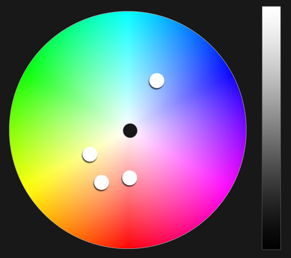
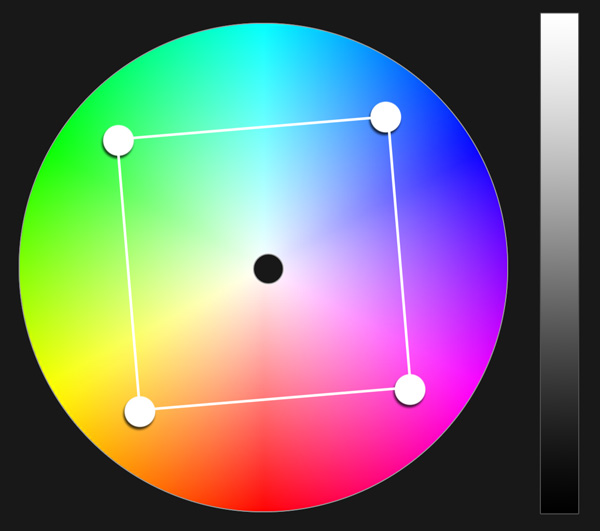
Note, each color scheme has a color wheel showing an example of the
colors, a potential color scheme example as swatches, and then an
example from my own artwork. The art examples shouldn't be considered
perfect representations of the color scheme type, they were not painted
for this tutorial, they were painted years ago and chosen as decent
examples for each scheme mentioned in the lesson. So don't worry if the
paintings don't match 100%.
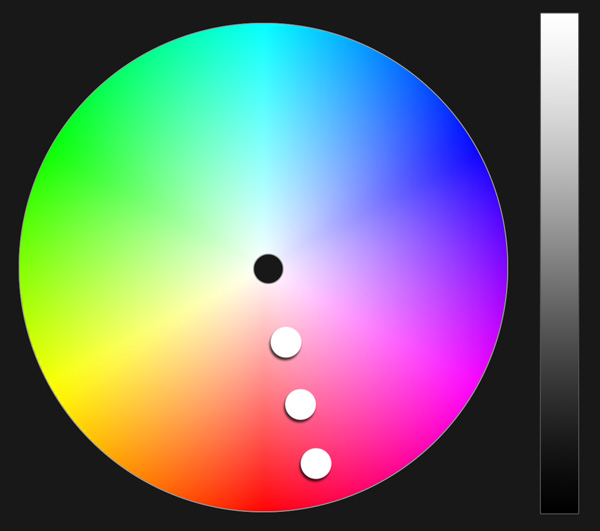
Monochrome
A monochromatic color scheme is an image that is mostly one color.
The color is modified by value (darker and lighter), and saturation
(how pure the color is), but remains almost entirely one hue. I usually
use it to to create an image that's mysterious, spooky, or bold, since
it relies almost entirely on Value to give contrast.


Complementary
In this color scheme, you pick one color on the color wheel, and then another color on the direct opposite side, and use both for your image. If you use less of one color and more of the other, it can really help draw the eye to the object that has the lesser seen color, which creates a focal point. Gives your painting a lot of visual punch.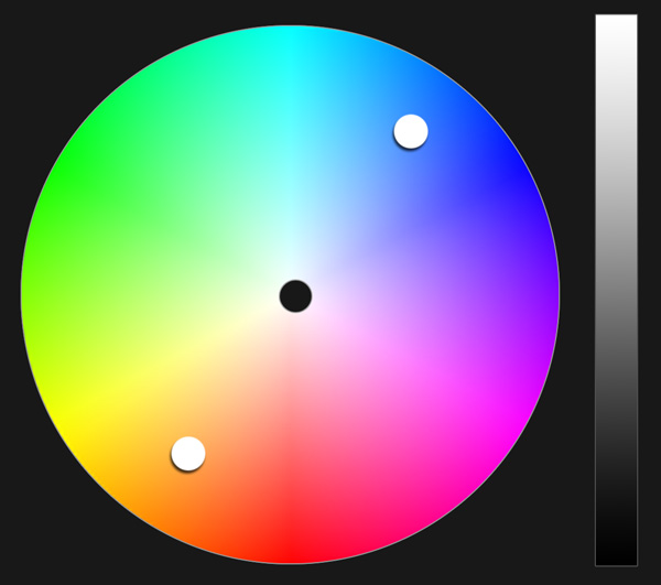


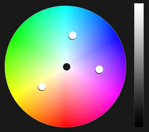
Split Complementary / Triad


Square Tetrad


Analogous
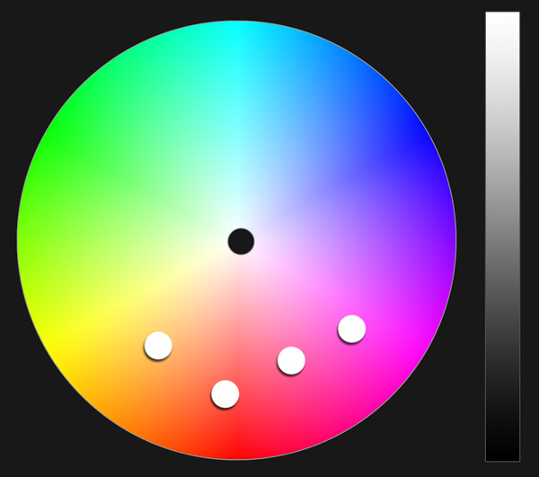


Analogous Complementary