Setting Up A Default Painting Comp
By Neil Blevins
Created On: July 6th 2015

There tends to be two types of approaches when it comes to digital painting.

So below is my default comp, a photoshop psd document that has a series of groups and subgroups, providing me an organized place to put all of the elements of my paintings. If you also want to choose the way of unlimited layers, then maybe this will give you some inspiration on creating your own default comp that's specific to your workflow, and the kinds of layers you use to produce your own unique artwork.

Base Level

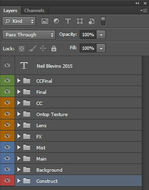
First, here's the highest level of my default psd file...


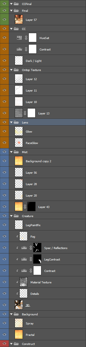
Now here's an explanation of each group and all of its sublayers...


This contains any work elements, usually masks, that I want access to, but that won't appear in the final painting.

A simple group for the background, whatever that happens to be.

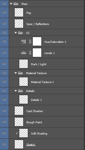
I have a main group for every major object in my painting. For example, if I have 2 characters and a mountain, then I have 3 main groups named after the element. Each main group has some sub layers.
  • On the sketch layer, I place a rough painted or 3d sketch of the thing I'm going to paint.
  • Soft Shading is a layer set to Overlay where I paint large soft black and white, to match the overall light of my sketch to the artwork.
  • Rough paint is where I start adding hand painted details, bringing the element up to the 80% mark. Sometimes I'll combine these first 3 layers into a single layer if I have a more finished looking 3d element I'm using.
  • Cast Shadow is where I add the cast shadow of the element.
  • Details is where I paint small details, plusing out the Rough Paint.
  • Material Texture is where I may place some texture from a photograph set to Multiply, overlay, etc, to add texture to the painting.
  • Dark / Light is like the soft shading layer, except its happens after all of the details have been added.
  • Levels lets me to an overall brightness color correction.
  • Hue/Saturation lets me adjust the saturation and Hue.
  • I then paint bright Specular Reflections on the object (if necessary) to help the object pop.
  • Fog is where I apply atmosphere so the object sits properly in the environment / background.

Since many of my paintings contain Mist / Fog / Atmosphere, etc, this is the layer where I paint that stuff, ontop of the subjects of the painting.

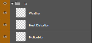
A few FX elements. I'll paint...
  • Weather (Snow, rain, etc)
  • Heat Distortion (if the image is supposed to be really hot)
  • Motionblur if an object needs to feel like it's moving fast (I'll frequently just do this in 2D using Photoshop's motionblur filter).

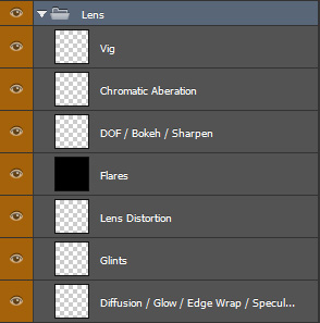
This contains various lens related effects...
  • Diffusion is a layer set to screen for general glow.
  • Glints is for little stars that appear on super bright reflections.
  • Lens Distortion is where I may adjust the perspective of the paintings a bit to give it a more dramatic look, like taking the photograph with a slightly spherical lens.
  • Flares is where I place Lens Flares (using subtlety of course).
  • DOF is where I blur out some features that are too close or two far from the camera's focus.
  • Chromatic Aberration is where I shift the color channels slightly to give that broken camera sort of feel.
  • And Vig is where I may paint a vignette, darkening the edges of the painting slightly to direct the eye to the subject.

To make things feel a little less digital, I'll frequently take scanned images of dirt and grime and layer them inside this Group, setting their Opacity to maybe 10% and setting them to alternate modes such as Multiply, Overlay or Color Burn.

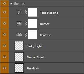
All my primary color correction.
  • If the image is supposed to feel like film, I'll add a film grain layer
  • a shutter streak (this simulates glow from previous "frames" of film contaminating the current frame).
  • Next is a layer set to Overlay or Soft Light where I paint Black or White with a large round blurry brush at low Opacity, just to help the lights and darks pop on the image.
  • Contrast is just a levels Adjustment layer, so I can make the image darker or lighter, or crush the blacks or whites.
  • HueSat is to adjust the saturation and maybe adjust the Hue slightly.
  • Tone Mapping is a Curves Adjustment layer, in case I want to do any major color shifts like add more blue to the darks (think a more subtle version of what instagram does).

I will then take all the layers below, flatten them and place a copy in the Final Group. Sometimes I will run this image through an external program such as Magic Bullet's Photolooks to apply other filters, placing the result of that into this group on top.

Any final super tweaky color correction nodes.

Just my signature as a text element.

An Example

Here's a psd file showing a portion of one of my paintings with all the layers / groups intact. Notice I don't use ALL of the default layers I mention above, just the ones that are appropriate to the painting.


So what groups and layers would you put into your own default comp?


This site is ©2023 by Neil Blevins, All rights are reserved.
NeilBlevins.com Twitter Mastodon Bluesky Instagram Blogger Facebook LinkedIn ArtStation Kickstarter Gumroad YouTube IMDB