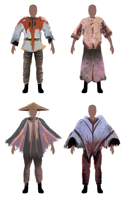
Sometimes
it's difficult to get original designs through standard painting.
Your hand will automatically begin painting lines and patterns that
are familiar to you. The "Photo Collage" technique is a
method to break these chains. It involves using photos of unrelated
objects to help the design process. In this example, I'll show the
clothing of the settlers. Watch the video below, or follow along for
the tutorial in text and images...
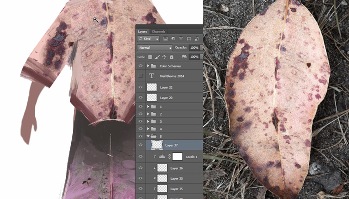
See the paintings below, the shirt's coloring and patterns are
actually based on
a leaf I took a photo of in a nearby park.
Here's my basic process:
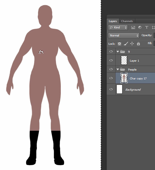
Step 1In step 1, I paint a simple 2d Mannequin in Adobe Photoshop on which I will be placing my clothing. Then I quickly paint the basic 2d shape of the clothing on a new layer. The colors don't matter right now, all that matters is the shape.
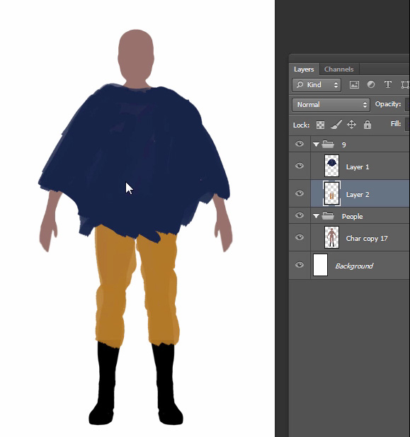
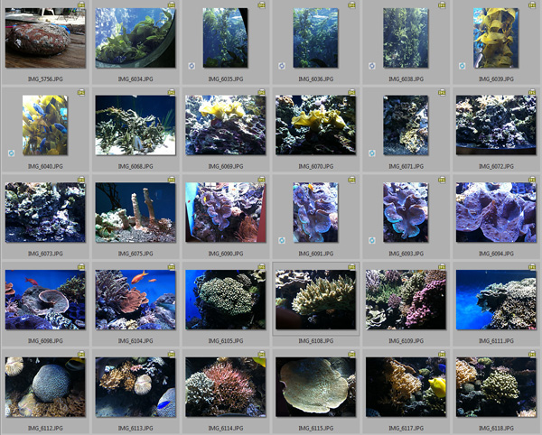
Step 2
I have a rather large collection of photos I have taken over the years. One of those folders is called "Coral", where I place photos of coral, shells and underwater plant life, mostly taken from my trips to the beach or aquariums. I pick a few images that seem to be good candidates, things with interesting patterns, and contrast in color or value (or both).
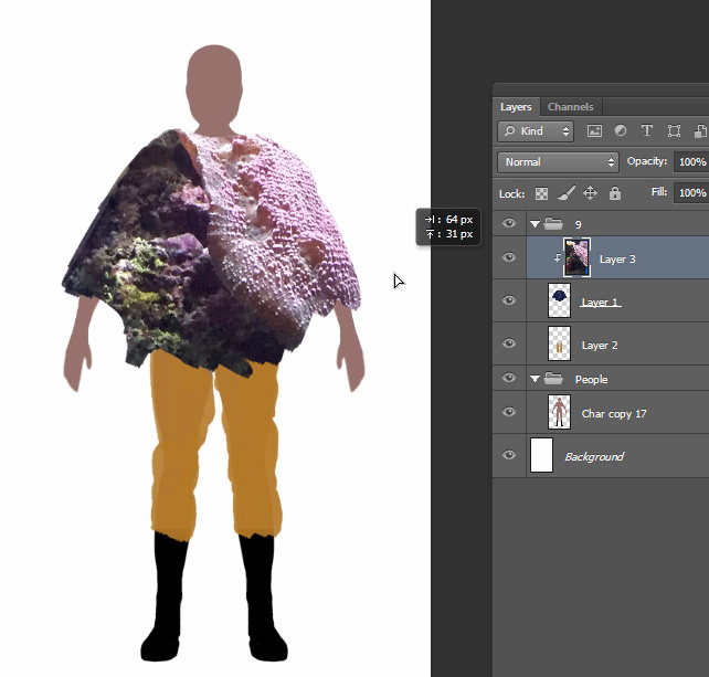
Step 3
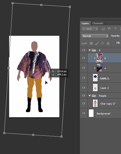
I place the photo on a new layer overtop of my clothing layer, and use "Alt-Left Click" on the line between layers to make it a "Clipping Mask". This means my photo will only appear on the opaque pixels of the layer below. I move, rotate and resize my photo until I get an interesting pattern on the poncho.
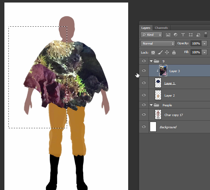
Step 4
When I've got a good pattern, I select half of it with the selection marquee and prepare to mirror it, since many patterns on clothing are symmetrical. Sadly, Photoshop has no automated way of doing this process, so it must be done manually.
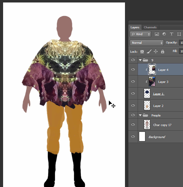
Step 5
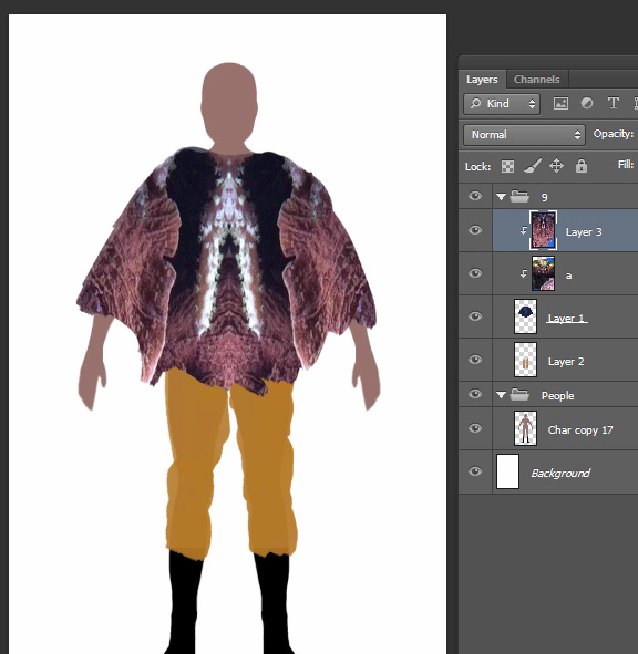
Here's the result of the mirroring process. I dig the overall colors, with the pink and darker red near the arms, then the bluish stripe in the middle and cream color near the neck. The small greenish details also give contrast. That's one, but its worth exploring more, you never know what you're going to come up with.
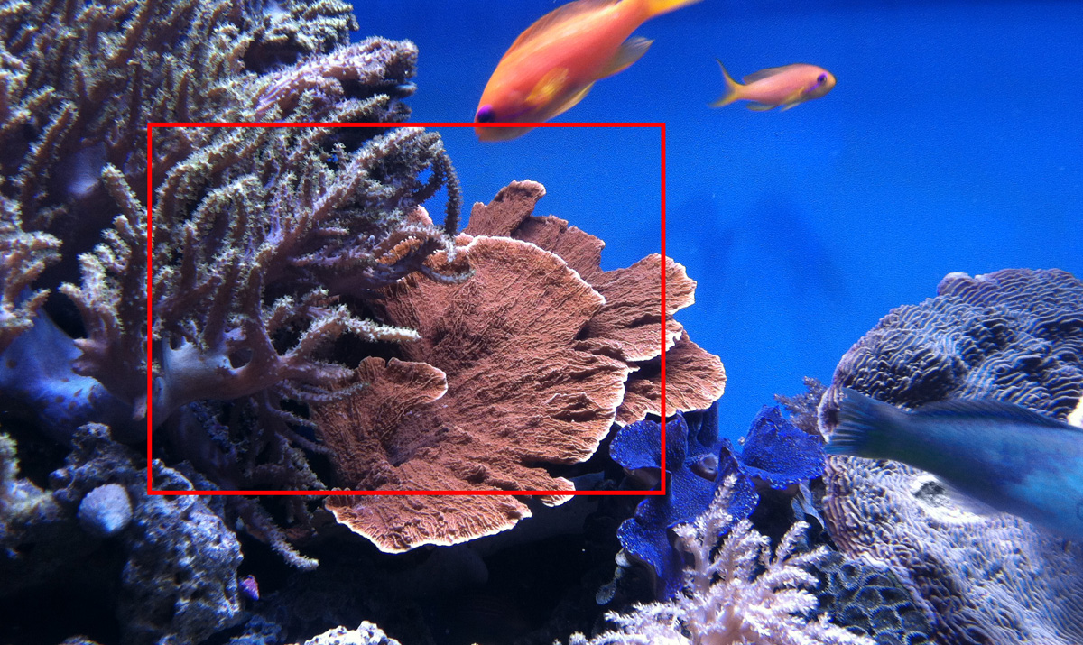
Here's a second picture from my trip to the aquarium. Again, I find an area that has some contrasting colors, and some interesting textural detail. The plate coral in fact almost looks like draping cloth without any of my help.
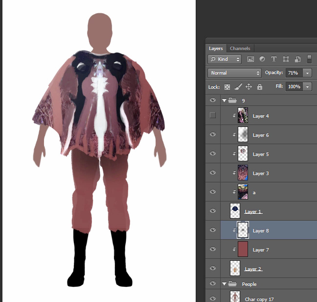
Step 7
I place this new photo above the first, set it to clipping mask, and begin randomly rotating, scaling and moving it.
Deciding when you've found a good composition is less science and more intuition, you have to wait for your brain to say "yes, that's it!" The more you do it, the better your brain will get at figuring out when you've hit on something good.
Also, feel free to use the same photo to create a number of different compositions, every photo can become a multitude of different textural variations.
Step 8
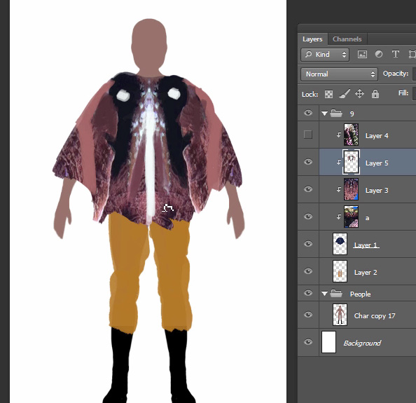
Here's the composition I ended up with (after mirroring). Notice how the plate coral part I noted earlier did indeed seem right placed on the poncho's draping arms.
And again, we have color contrast, the arms are pinker, near the neck is a darker blue, and a white stripe traveling down the middle. Also feel free to modify the colors of your image. Place a "Hue / Saturation" adjustment layer above your photo (set this to clipping mask as well) and adjust the Hue value. The colors of your original photo will shift through the rainbow. You may find a color combination you like better, or a color combo more suited to whatever project you're making. Try other adjustment layers as well like "Color Balance", try using the Colorize feature of "Hue / Saturation", or "Curves".
Step 9
Now the painting begins. The goal is to accentuate the pattern that already exist.
The white line down the center is painted over to be more of a straight line, maybe stripes on either side of a zipper. I paint white dots on the shoulders to liven up the big blank blue areas. I try and enhance the natural lines in the pink area by painting lighter pink stripes to contrast with the darker red color.
I then reduce the size of the white dots because they started looking too much like eyes, and because they are white dots on a dark background, they were too eye catching (people tend to look at areas of value contrast first when looking at something).
I also add a lighter pink fringe on the bottom of the poncho to separate it from the legs.
Step 10
I color the pants pink as well. Then I place a new layer above the poncho and the pants layers, set them to "Soft Light", and paint simple light in with a large soft brush. I paint it darker at the top of the pants to simulate the shadow of the poncho on the legs, and paint dark on one side of the poncho and light on the other to give the impression of a light source from the high left. I feel this just gives the painting a little more dimensionality.
And
that's it, for a final piece I'd add more detail, but this is fine to
get the costume idea across. Now it's time to move onto the next photo
/ painting, knock out as
many of these as possible to populate the Oasis.
Exercise
If you really want to drive the point home, here's a little exercise
you can try. The goal is to make your own character clothing thumbnail
sketch.