Using Keywords To Define A
Visual Design
By Neil Blevins
Created On: Aug 11th 2021
Created On: Dec 3rd 2024
Software: None
While sketches are important when coming up with a visual design,
don't under-estimate the power of the written word. For example, if I'm
designing a character, writing its bio can be super
helpful when it comes time to do those first sketches. But even a full
bio can usually be distilled down to a few keywords or "design pillars"
that define the
look, and may be enough of a springboard to start those
initial explorations.
When coming up with the final design for "Inc The Robot" from my
first book project, I used keywords to
help define the most important elements of the character, and whatever
new design was going to land needed to have those elements to
be successful. So I'm going to discuss those keywords, and then show
how they ended up influencing the design exploration of the robot
character.
You have two choices with this lesson, watch me discuss the issue in
the video below, or read the full text.
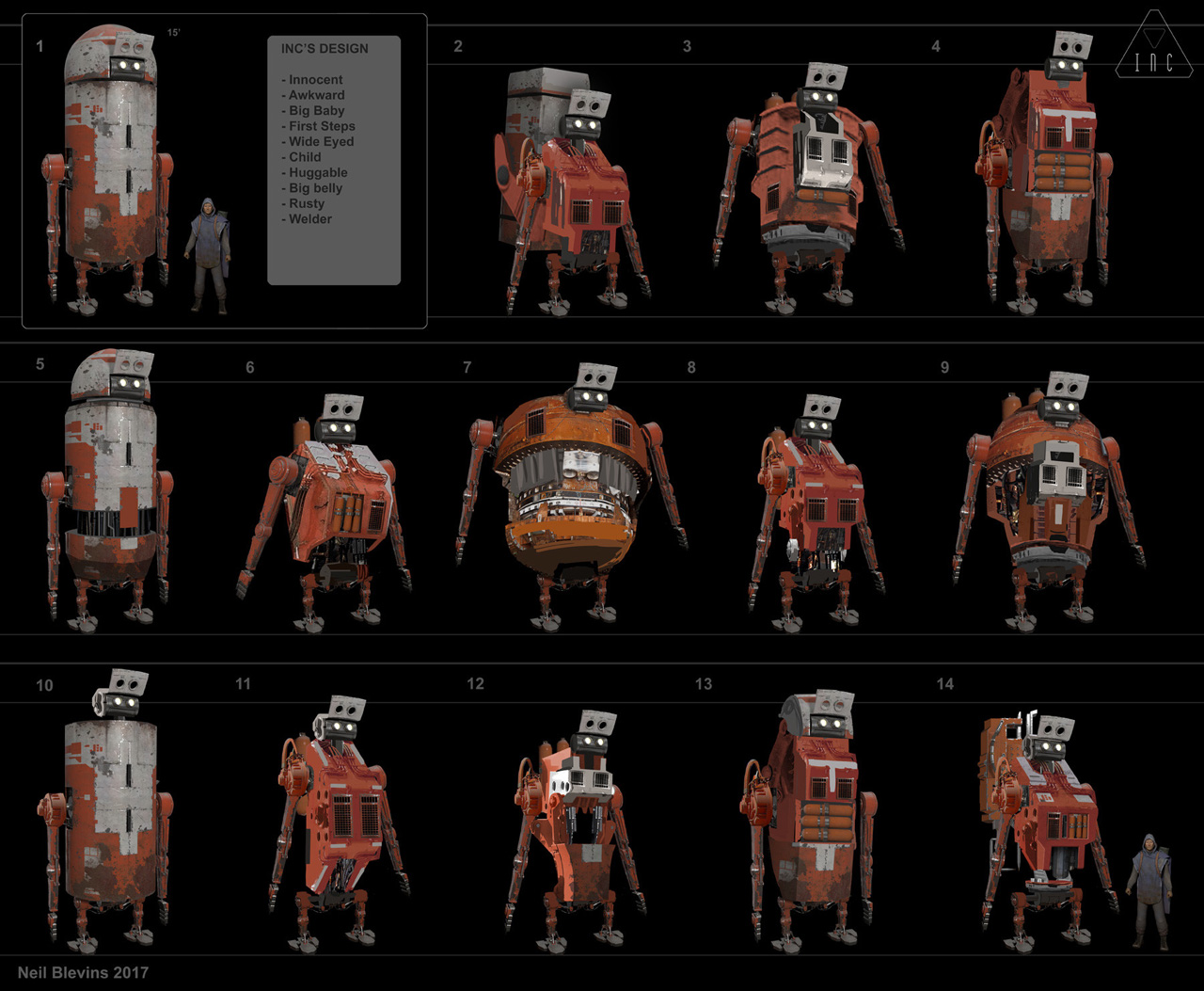
So first things first, here's an image showing off a bunch of
designs for Inc The Robot.
The Keywords
Let's start off with the keywords.
So one big advantage we had before doing the final Inc design was the
story of the book was already written. At its core, "The Story Of Inc"
was a buddy comedy. The human protagonist, Landis, was afraid he would
be a bad father to his unborn child. Without giving too much away for
those who haven't read the book, he buys Inc The Robot for a different
purpose, but Inc The Robot's true role in the narrative was to be a
"proxy" child, basically to give Landis some experience dealing with a
child before he had to do it for real. So therefor, Inc's design had to
support this narrative.
So when coming up with keywords, we can start with the obvious
appearance based ones. Inc was constructed to be a "Welding" robot, so
his design needed to have a construction feel to it. And he had been in
use for years and years on a desert planet that had plenty of storms,
so he needed to be "Rusty".
The remainder of the keywords were focused on him being a "Child". He
needed to look "Innocent" and "Wide Eyed". He needed to look a little
"Awkward", like a "Big Baby" who's taking his "First Steps". We wanted
the audience to fall in love with him as a counterpoint to the gruffer
Landis character, so we wanted the reader to just want to give him a
big "Hug" on his "Big Belly".
The Designs
We won't be going through all of the design iterations, but let's focus
on a few of them that were my favorites or who show off this use of
keywords. All of these rough paintings are a combination of
photobashing, bits of 3D, and some hand paint. Close up they look
rather crude, but that's fine, the idea was to get the general picture,
and then whichever one we chose I would add more detail to for the
final book. Also, I'll discuss a few other design considerations beyond
just the keywords, since they'd likely be helpful showing my thinking
when choosing the final design.
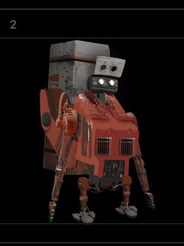
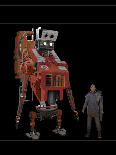
Design 2 was a favorite among many of the people I showed. First his
design shows off that he's some sort of construction robot. The orange
color is part of that, but also the big vents on his chest, the exposed
wires and pipes. And he has a flip up mask, which is common for human
welders to wear. All of the iterations had big giant eyes. Having large
eyes is a common design trope to denote the character is a baby or
child, it's overused, but it works, so that part of Inc never changed.
All of the iterations had these short stubby legs, which was
specifically to show how awkward he is, like the baby taking their
first steps. You can almost see this top heavy robot trying to walk and
maybe falling over if his balance wasn't quite right. Other attributes
that were popular was his backpack, because the backpack is so large,
one person I showed the design to said that it really felt like the
robot was a young kid going to his first day of school, and wearing a
backpack that's a tiny bit too large. The flip up welder helmet also
helped with this, as it almost looked a bit like the rim of a a
baseball cap, another design choice that makes him look childlike.
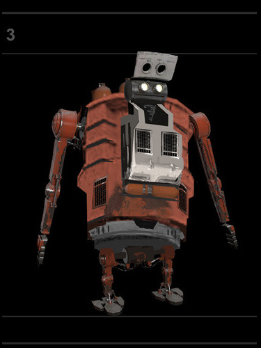
All the next designs have some similar elements, so I'm going to focus
on the elements that are different. Design 3 was a little shorter and
stubbier, and wider, which made him even more top heavy and hence
awkward. But that big belly also made him more huggable, because design
2 was more square, and this design is more round, and hence easier to
hug. You can see the gas tanks on his back sticking up a bit which
would show off that he had something to do with construction or
welding. One practical problem with this design was that his head would
have trouble turning left and right because of how it was seated on the
body, which was one of the reason this design wasn't picked.
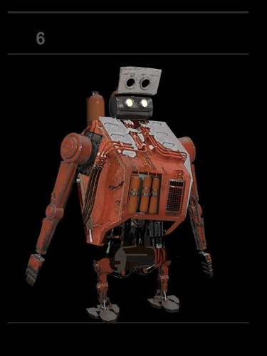
Design 6 showed more exposed wires and pipes on the lower part of the
body. He had the big belly, but not as big as in design 3. A number of
gas tanks were added to the chest, so they're far more obvious. And I
liked the white and orange of the upper chest, I though having the two
tone color helped make the head pop, a detail that did end up in the
final design.
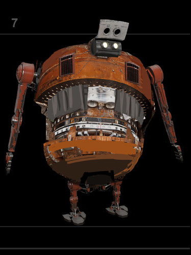
Design 7 was really going for the awkward / big belly keywords. The
chest idea was inspired by a giant boring machine. His head also had
that same problem of looking left to right. In the end, while he was
huggable, he was pushed so far that he went from awkward to ridiculous,
so he was not chosen.
Design 8 was the closest to what became the final design. He was
awkward but not too awkward. He had a big belly, but not too much of a
belly. A decent compromise on many of the keywords.
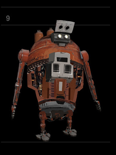
Design 9 was taking the far too plump Design 7 and seeing if it could
still work if he wasn't quite as wide. This gave him a bit of an egg
shape, which worked well with the "child" keyword, since an egg hatches
to become a baby bird. However, it also gave him a bit of a hunchback
feel to him, which was certainly awkward, but might repulse people a
little too much, making him less huggable.
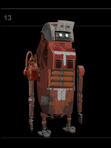
Design 13 was going for a taller and thinner design. While his original
design was a trash can with arms and legs, this was similar except he
was more of a mail box with the semicircle helmet and the flip top at
the face. In the end, looking like a mailbox was decided to be the
wrong move. It made people laugh him, you wanted people to see his
design and go "awww", not "haha". Plus, the flip top welder mask now
read so much like a mail slot, it didn't read "welder" as easily, which
meant his task wasn't as obvious.
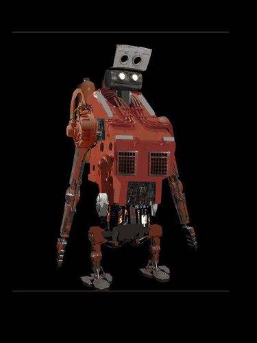
And here's the final rough design, before he was modeled in 3d. You can
see we used design 8, but added his welding gun to his back, which gave
it a little of that "boy with a backpack" feel from Design 2. Going
down the list of keywords, which some designs really pushed some of the
words, this design we felt checked off all the boxes while balancing
the attributes in a successful manner.
Conclusion
So next time you're doing a design, try writing down 5-10
keywords that show off the pillars of the character. And when looking
at your sketches, use them as a checklist, not just to make sure all
the keywords are covered, but that there's a good balance between all
the different attributes. This short little list will help you make a
cleaner and more readable design, and I hope it becomes a more
important part of your own design process.
This site is ©2026 by Neil Blevins, All rights
are reserved.
To see hundreds of other tutorials similar to this one, visit the
Neil Blevins Education Site