Metal Materials For 2d Artists By Neil Blevins Created On: Oct 19th 2025 Software: Any
Every material, whether wood, plastic or metal, have different visual
qualities. As an artist, we need to capture these visual qualities if
we want people to be able to tell that an object in our art is made
from a specific material, and this is true regardless of whether your
work is photoreal or highly stylized. In this tutorial, we will explore
the visual properties of metal and how to best create them in 2d, from
more realistic to very stylized.
Visual Properties Of Metal
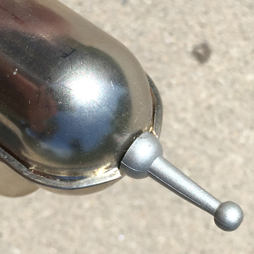
Here's a photo of a real metal toy...
When it comes to the visual properties of metal, the look of metal
is primarily 2 parts, a base color (diffuse reflection) and it's
shininess (specular reflection). In metals, the specular reflection is
far more prominent than the diffuse reflection, making it easier to
tell the difference between say metal and plastic. Both metal and
plastic have
specular reflections, but they look quite different. For more info on
reflections, see my tutorial on Material
Properties For 2D and 3D Artists
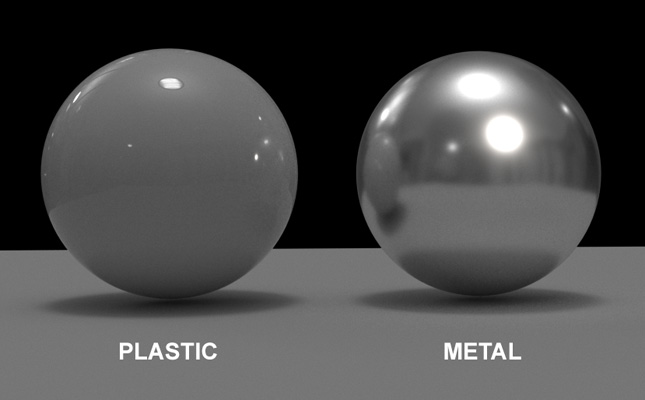
Here's the recipe for metal...
For the diffuse color, most metals tend to be a darker grey
(unless
dealing with a colored metal like gold).
A very strong specular reflection
that's reflecting its environment.
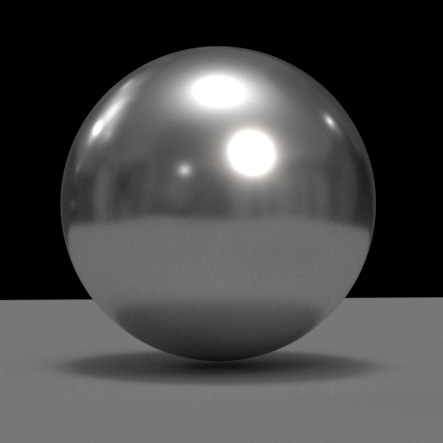
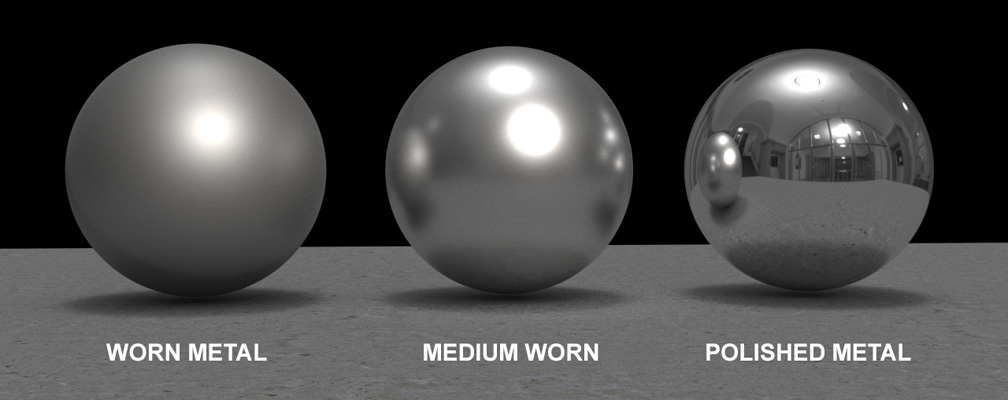
Metal Ball
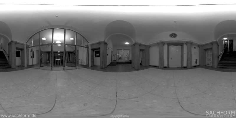
The Environment the metal ball is sitting in, and hence is reflecting
While the specular reflection is usually stronger than plastic, it can
be comparatively stronger or weaker, and sharper of more blurry,
depending on the type of metal.
Worn metal (metal that's old and distressed) tends to have a less
intense specular reflection, and the reflection is blurrier.
Polished metal (which is new and smooth) tends to have a more
intense
reflection, and the reflection is sharp.
Most metals fall somewhere on this spectrum...
So now that you know a bit about how metals look in real life, lets
talk about making them in 2d.
Painting Realistic Metal
If you're going for something in the realistic to
painterly area, your goal is to replicate what happens in the real
world. For that, here's a procedure for painting metal that works in
any 2d paint program (for this example, I'll use Photoshop but these
features exist in pretty much any paint software).
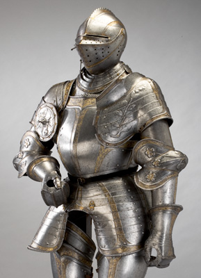
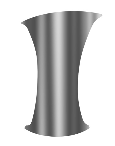
Let's paint a simple cylindrical style piece of metal, say something
like the upper part of the glove of a medieval knight.
Armor for Gustav I of Sweden by Kunz Lochner
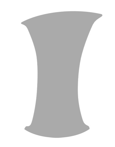
I'll start with a plain grey shape.
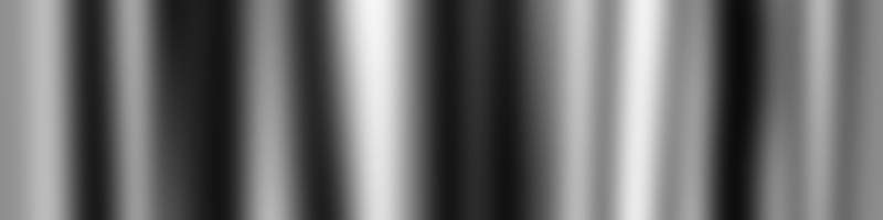
Add some reflections of the environment. If your object is in a
specific environment, consider using that, if not, a set of white and
black stripes will usually do.
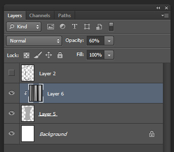
I usually place the stripes on a new layer above the grey, use the
shape as a clipping mask, and then reduce the new layer's opacity to
mix it with the grey color.
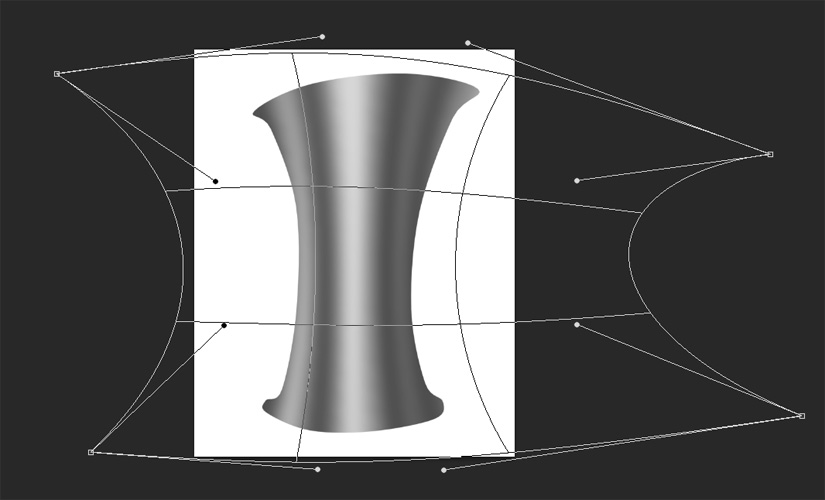
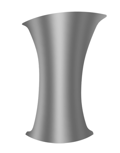
This looks good, but the stripes don't follow the surface very well,
they go perfectly up and down while the surface is curved. So I use a
transform tool to warp the
stripe layer a bit so it fits the shape of the cylindrical object...
Now on a new layer, clipping to the shape, paint a highlight in white
with a sharp brush. Make sure your highlight is placed on the correct
spot of the surface depending on where your bright light is in your
scene. For this example, lets say the sun is right behind the camera,
so
the highlight will be right in the center middle...
Now on a new layer use a blurry brush colored white and paint around
the highlight to make it glow...
Play around with the contrast of your metal to get some more blacks in
there...
Check some reference, and see how well you did...
Remember, if you want more worn metal, increase the blur on your
highlight and reflections layers, then reduce their opacity so the
shine isn't as bright...
And if you want it to feel even more worn, consider painting some dirt
on top using a Dirt Brush
or adding a photo texture of scratches and dirt over top...
Now when people see this object, they'll immediately think metal, and
not just some sort of grey plastic.
Painting Stylized Metal
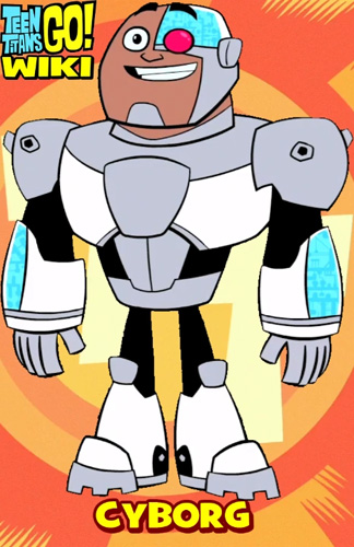
When painting cartoony or stylized metal, say for anime,
you should follow a similar formula, except make the results sharper
and simplified.
Here's some examples showing metals in a more cartoony way.
The simplest is to just use a flat grey color to indicate metal. Works
in some situations, but may be a little too simple.
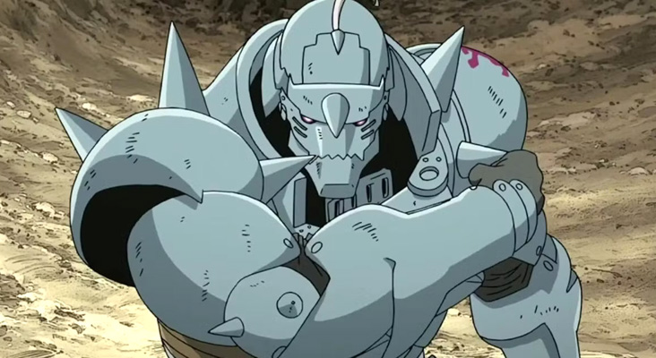
Here's an example from the anime Full Metal Alchemist. This is more
complex, where the armor has a grey color, but then stripes of darker
grey and lighter grey.
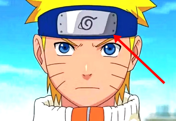
Similar with Naruto Uzumaki...
You may wonder why the metal in anime tends to be this simplified? It's
mostly because animating metal objects in 2d is a pain. Remember, it's
reflecting the environment. That means, if the metal object moves, the
reflection stays aligned with the environment. So the reflection will
move across the object, it won't stay locked to the object. So this
adds extra difficulty and hence cost when animating. So most of the
time reflections
are super simplified to reduce the time it takes to paint them while
still feeling like metal. If you're making still images, you can make
your metal more complex because your object won't be moving.
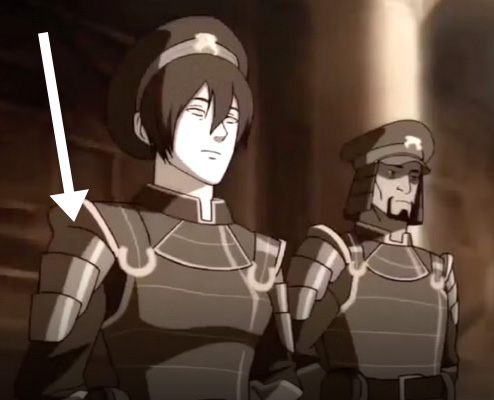
Here's a little more complex metal from Legend of Korra...
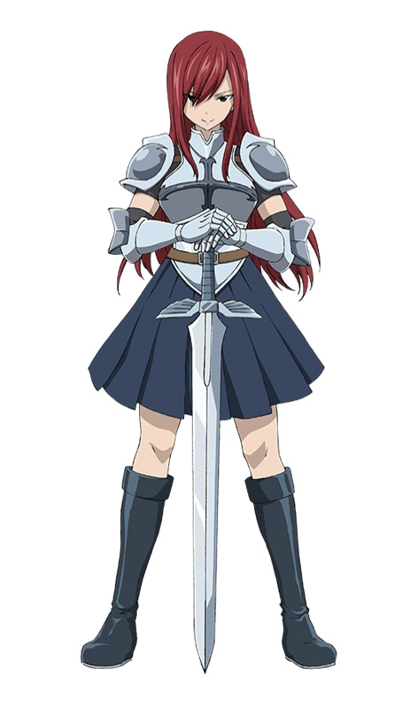
and the character Erza Scarlet...
You can see the sword has many grey, white and dark grey stripes along
its surface, which gives it that metal feel.
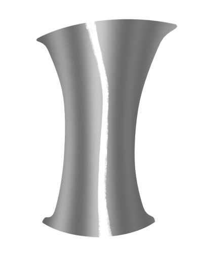
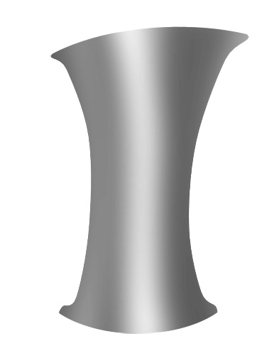
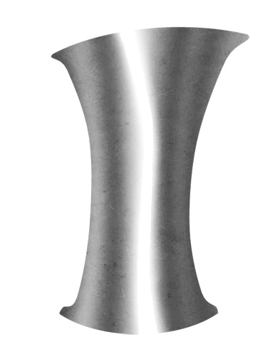
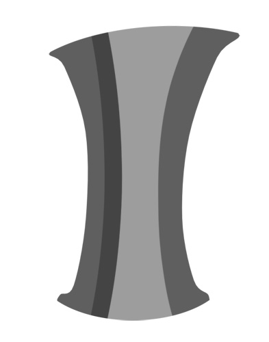
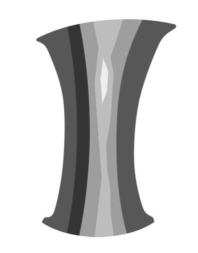
So lets start again with that grey surface...
Add some darker stripes on another layer, but make them more hard edge
by painting them with a hard edged brush...
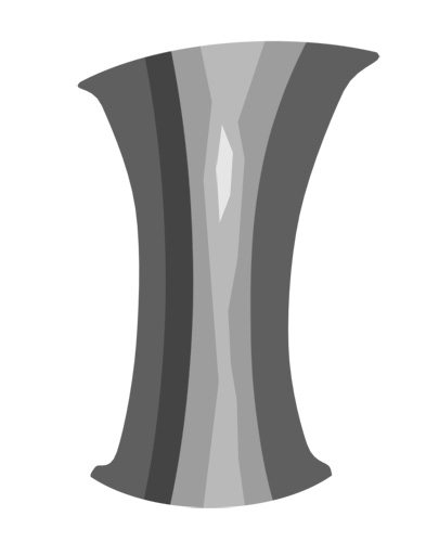
Now paint a highlight stripe in brighter grey, I've added a bit of a
random shape here to add variety...
Then paint with the same hard edge brush a brighter highlight in the
center...
Then maybe play with the contrast to get some brighter brights and
darker darks.
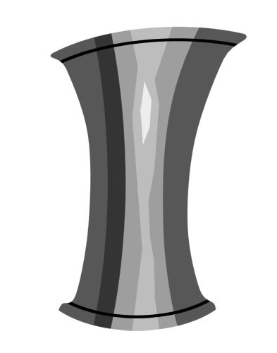
One last little bit, I add two hard edge lines showing the metal
folding over at the top and bottom to create lips...
To make it even more realistic, I adjust the reflection on the two lips
to make it slightly different than the main part of the shape.
Different surfaces will have slightly different reflections.
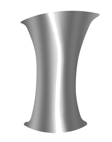
If you want metal that looks more worn, you can't blur it like you did
with the realistic metal, but just make all of your stripes, especially
the highlight stripe, a lot fatter, then reduce their brightness.
Conclusion
Hopefully this helps you the next time you want to paint
metal in 2d.