Tiled Floor Material In Photoshop By Neil Blevins Created On: Sept 2nd 2008 Updated On: Dec 5th 2024
Software: Photoshop
Here's a few tips on ways to make tiled floors more visually
interesting and realistic. A lot of people will make a color map, and a
bump map to lower the grout, and that's it. But in reality, a tiled
floor has a lot more subtle variation going on. In this tutorial I'll
show the various maps you need to paint in photoshop, and will use
3dsmax to show off the result. But this technique can be used with any
3D App you want.
Here's the basic ingredients we'll be adding...
A color pattern of some sort
a grout color, with wear and tear
slight color variation between tiles
a disp map for the color pattern
a disp map to displace the grout down, with wear and tear
a disp map to add slight height variation to the tiles
a disp map to vary the tilt of each tile slightly
A photo of a real towel from a catalogue.
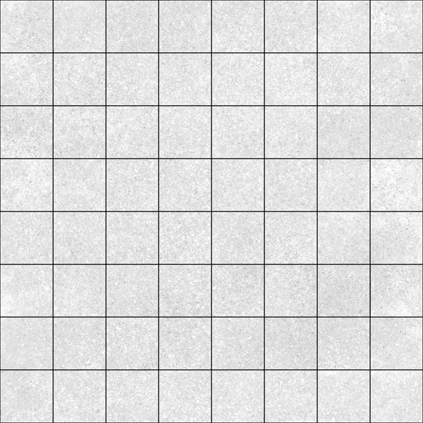
Color Pattern
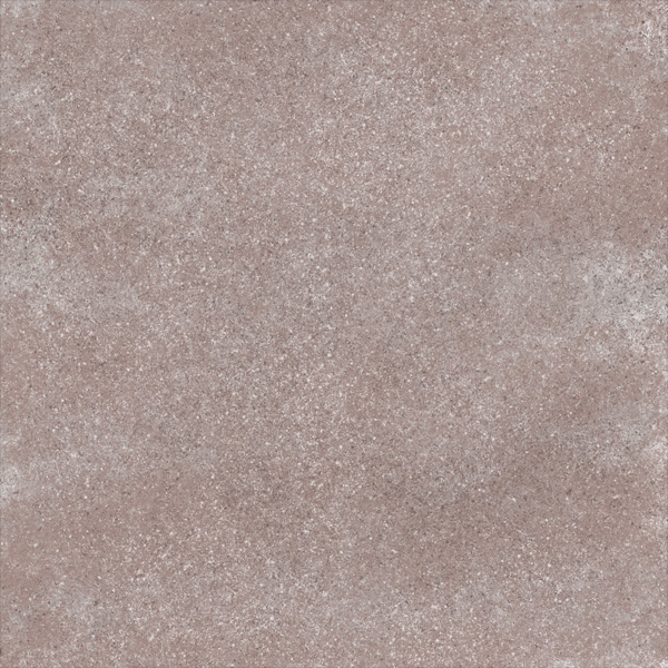
Lets start with a color map. In photoshop, make a largish
image, say 2048x2048. Create a new layer, call it "Pattern Color".
Using a few dirty brushes, I paint a speckly pattern. Feel free to
replace this with a photographic map if you'd like, for example, a
bitmap of rock or marble would be a good start.
On a separate layer, lets create the grout (Call this layer "Grout
Color"). This is the most important layer, since so many other layers
depend on it, so take care creating it. I tend to use the "Single Row
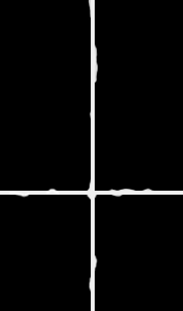
Marquee Tool" to select lines that will become grout.
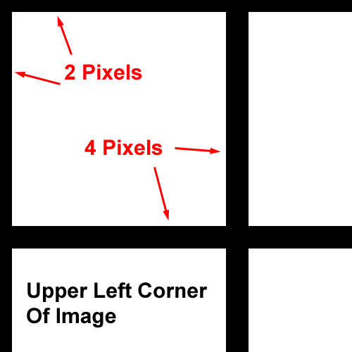
Make sure the grout is accurately placed using the View -> Show
-> Grid function. And make sure the grout is always the same width,
so that each tile is exactly the same size, or else you'll have trouble
with some of the tricks below. The grout needs to be tilable, so if
your grout is 4 pixels high, remember that at the top, bottom, left and
right of the image your grout should be 2 pixels in size, that way when
the map gets tiled, the 2 pieces of 2 pixel grout will become 4 pixels.
After I create all the grout going horizontal, I duplicate the layer,
rotate it 90 degree (to create the vertical grout lines), and then
flatten that layer into my original "Grout Color" layer, which gives me
my grout pattern. If you plan on getting closer to the grout, you can
give it a little texture, but for this example I'll keep it a brighter
grey color.
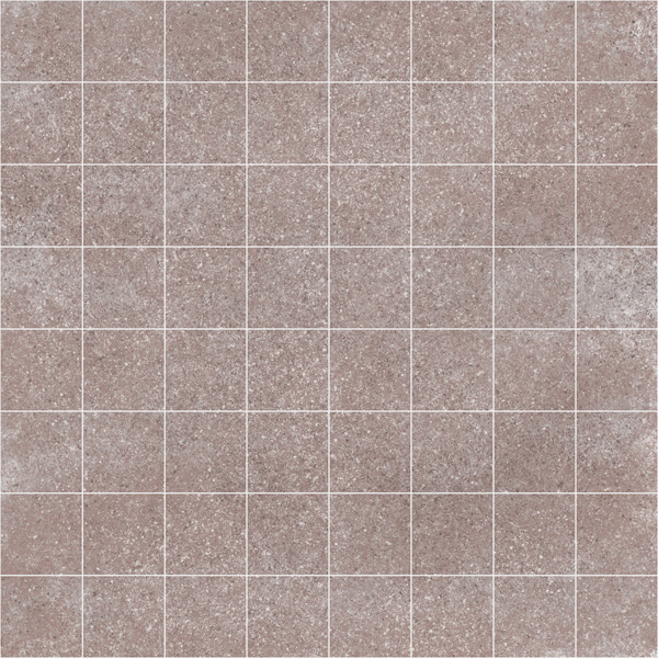
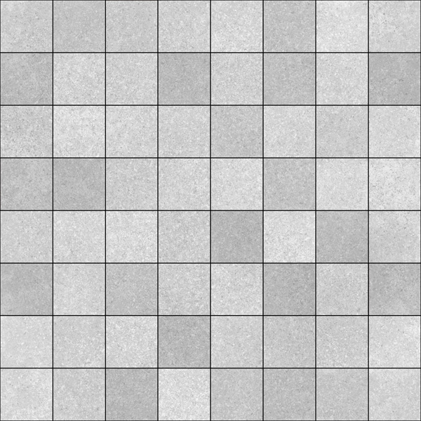
Now remember, the floor was supposed to be made by separate tiles. But
you made one large image. So to simulate different tiles, I use the
"Magic Wand Tool" to select the interior of one tile on the "Grout
Color" layer, then I move down to the "Pattern Color" below, and rotate
either 90 degrees, 180 degree, or flip horizontal, or flip vertical. Do
this faster by assigning these commands to hotkeys. Do this for each
tile, or at least a bunch of random tiles, so that the pattern looks
like each tile is a totally separate piece of tile. If your pattern is
noisy enough, this step may not be necessary. Notice how the result
looks less regular than the pattern above.
I also go in and add very slight irregularities to the grout on a
separate layer (call it "Grout Wear Color"), like rounding some covers,
putting in the chipped areas, just to make sure it's not too perfect.
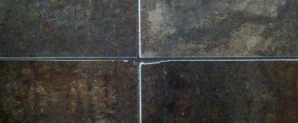
Here's a real world example...
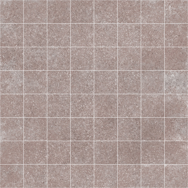
In the real world, each tile produced may be a slightly different from
color from each other. This is because each tile could have come from a
different plant, could have been created on a different day, could have
been made from slightly different rock. Create a new Layer called "Tile
Color Variation", select individual tiles on the "Grout Color" layer,
then fill that selection on your "Tile Color Variation" layer using the
"Paint Bucket Tool" with a random color between white and black.
Now set this layer to "Color Burn", and then adjust the layer's
opacity, maybe 10-20%. Remember, you don't want the tile pattern to
look like a mosaic, just slight color variation. Make sure this layer
sits above the "Pattern Color" layer, but below the "Grout Color"
layer. Notice how each tile appears to be slightly a different shade
from the next.
Displacement Pattern
So for the first part of our displacement, duplicate your "Pattern
Color" layer, and use Image -> Adjustments -> Desaturate to
remove the color. Then use the Image -> Adjustments -> Levels
tool to make this layer look close to white, with just a slight bit of
variation. This will be the bump that corresponds to your original
color map. Name it "Pattern Disp".
Now select both your "Grout Color" layer and your "Grout Wear Color"
layer, duplicate them, then click the "Lock Transparent Pixels" button
for the each layer. Then go to Edit -> Fill and fill each of these
two layers with black. By locking the transparent pixels, you'll retain
your grout pattern, but make it black instead of it's original color.
Place these new layers, called "Grout Disp" and "Grout Wear Disp",
above the "Pattern Disp" layer.
In the real world, not every tile is exactly the same thickness. To
simulate this, I use a similar technique to adding the Color Variation
per tile. Create a new Layer called "Tile Disp Variation", select
individual tiles on the "Grout Color" layer, then fill that selection
on the "Tile Disp Variation" layer using the "Paint Bucket Tool" with a
random color between white and black. Now set this layer to multiply,
and then adjust the layer's opacity, maybe 10-20%. Place it above the
"Pattern Disp" layer, but below the two "Grout Disp" layers.
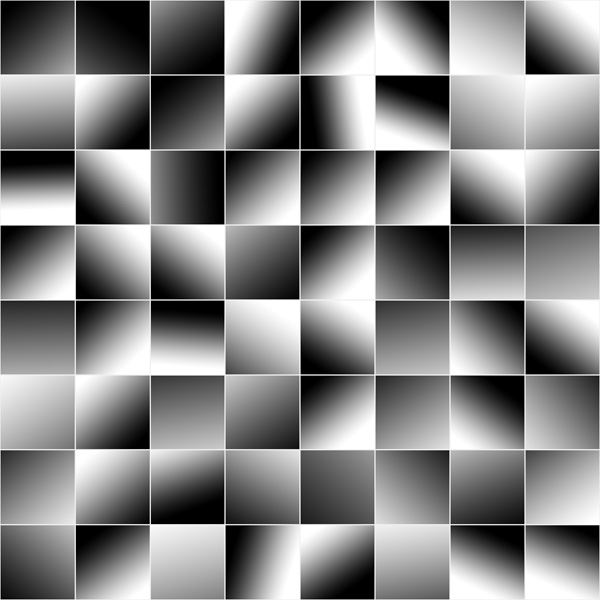
Now when a tile is placed, is also frequently isn't placed 100% flat on
the ground. One corner will sink into the ground a bit more than the
other, causing each tile to be slightly tilted. To simulate this,
create a new layer called "Tile Disp Tilt". Select individual
tiles using the "Magic Wand Tool" on the "Grout Color" layer, and then
fill them on the "Tile Disp Tilt" layer with random gradients
using the Gradient Tool.
If your tile floor is made of say linoleum instead of rock, then feel
free to paint in curling up edges and such on this layer. But for
stone, each tile tends to be pretty flat along the top surface.
Then place this layer above the "Tile Disp Variation" layer, set it to
multiply, and set its transparency to 20-30%.
This step especially will help break up your specular on the floor.
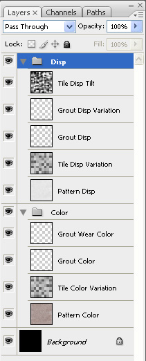
Your Photoshop Layers should look something like this...
Save your psd file.
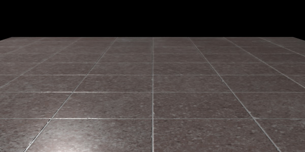
Now select all your color layers, collapse them, and save them out as a
tif. Then select all your disp layers and write them out as a tif as
well. Bring them into your 3d app, and plug them into your color and
displacement channels of your material. Here's the result...
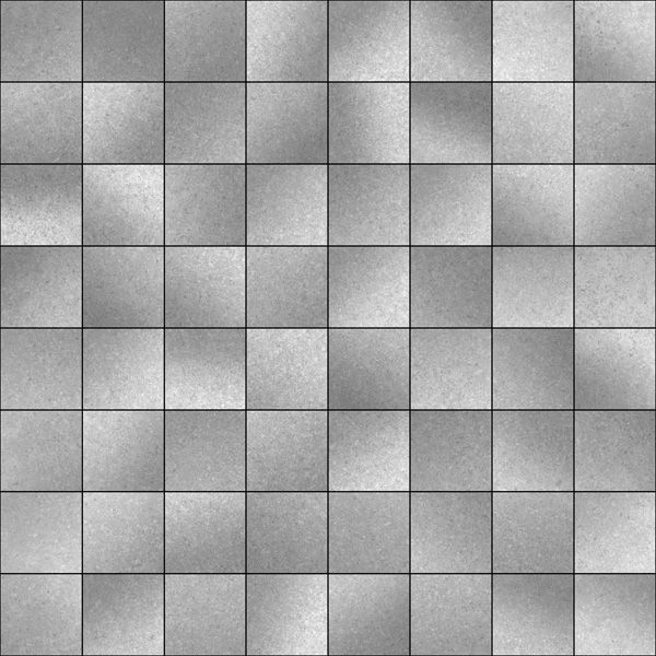
Some more things to try include adding...
- a dirt layer to the tiles, footprints, scrapes and knicks.
- Add scratches to the displacement layer
- add variety to the specular and reflection channels, so some areas
are more shiny than others.
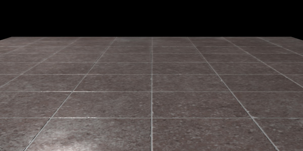
Here's the same floor but using a noisy texture in the specular map,
notice how much richer the image gets.
Also, once you've done this once, feel free to just modify the color of
the tiles to do all your tiles for your future projects. Why reinvent
the wheel? Reuse as many layers from this psd file as you can when
making new tiles.
Also, if you have a really large area to add tiles too, you may start
notice a repeating pattern. If this happens, try using my Tiling A Map On A Ground Plane
tutorial to avoid the repeating tile.